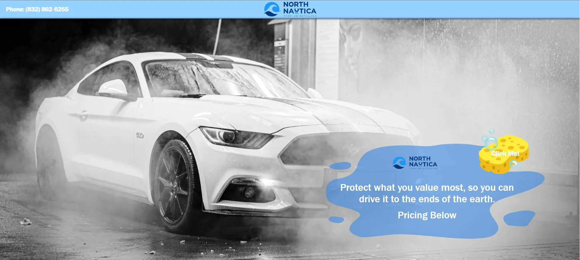
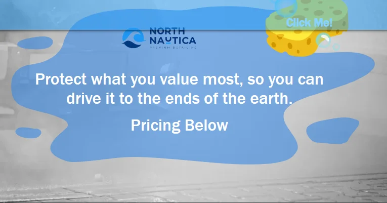
Gray hero before interacted with.
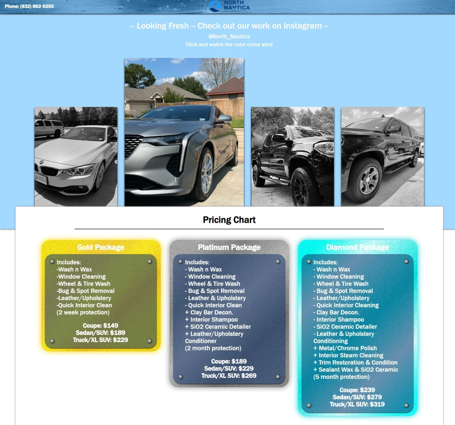
Stylized package listings.
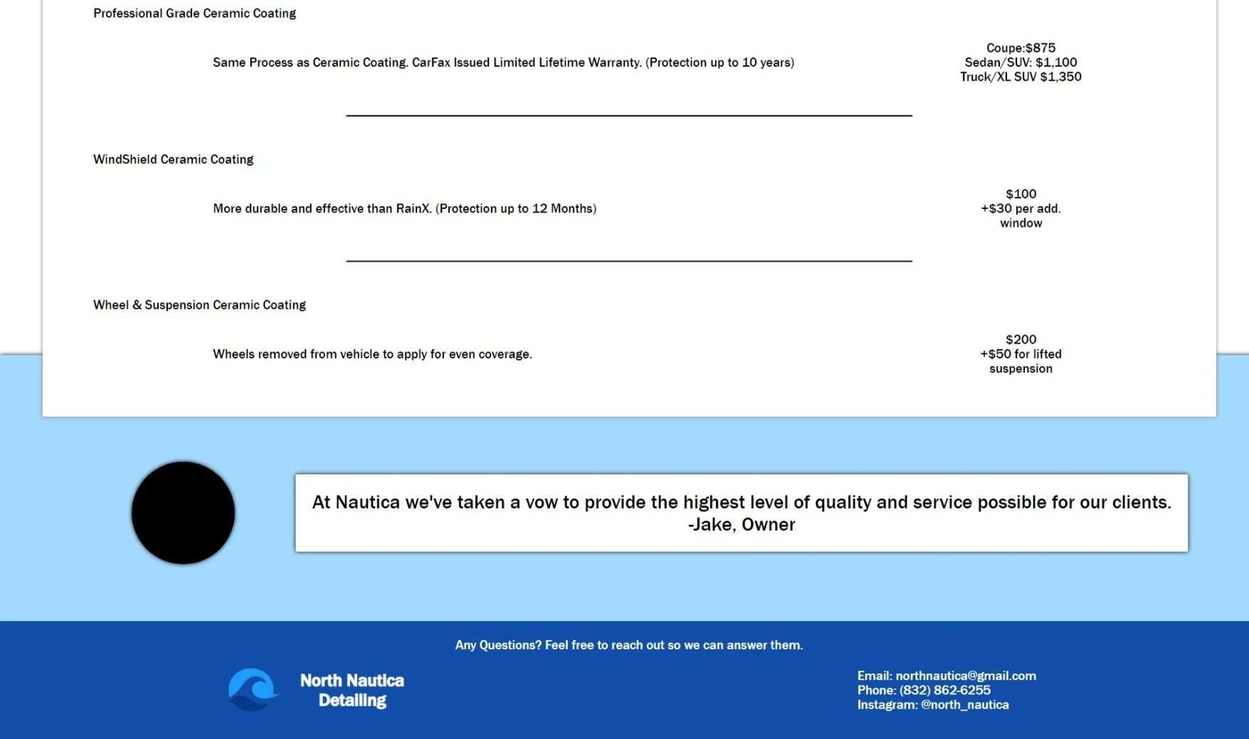
Simple quote and footer.
OVERVIEW:
NorthNautica.vercel.app was a website created for a friend for free. This website was meant to serve as an online pricing sheet for his small business. It was made during my free time one week, and meant to be just personalized enough to not look like a Wix site.
Main Tech Stack:
Astro.js, HTML/CSS/JS, Vercel
Other technologies:
Github, Affinity Suite, Boxy SVG Editor
TECHNICAL GOALS:
My goal with this website was to see how well I could make a curated site in less than a week, working only a couple hours a day. I worked less than 12 hours to produce this. It was a nice challenge to really see how far I've come as a developer. It was also one of my first experiences with vercel.
NOTABLE FEATURES:
Time Frame:
This project was meant to be quick and simple. It was a free, single page application built in 1 week. It was to allow my friend to link to a static pricing sheet from social media and adverts.
Hover-to-Color:
A small touch to make the site feel a bit more premium. When you hover on the soap and water on the hero image, the image fills in color from the black and white default.
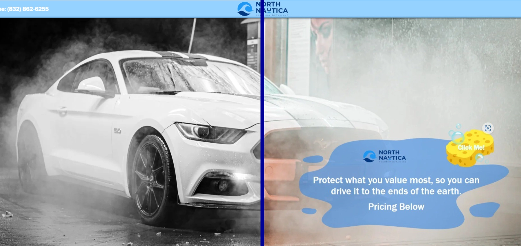
Clear Header:
Made to look like glass, which is servicable by the business, this header looks clean and presentable to any potential customer.
HURDLES:
Graphics:
The client already had a graphics package available, however, they did not have SVGs, so I had to reproduce a couple graphics to make them satisfactory. Also working with low-contrast graphics made some design decisions difficult given the time restraint I set for myself.
Communication:
The client is a student in college, who was at the time working through midterms. It was difficult to get in touch to work with him in finishing the website. At the time of writing this it is undelivered.